Want to improve your website? Improving the navigation goes a long way towards that goal. Menus are central to the user experience (UX) of your website and affect traffic, bounce rates, session length and conversions according to Kissmetrics. Here are seven helpful tips to help you optimize your site’s menus for better usability.
Keep It Simple
Complicated menus are non-intuitive and difficult to use. New site visitors’ fleeting attention spans usually do not allow for deep study. Eye-tracking research shows that users form an impression of your site in as little as 0.2 seconds. Too many top-level menu options are hard for users to process and Hick’s law tells us that more choices lead to indecision. Aim for 7 or fewer categories in your top navigation.
Follow Well-accepted Navigation Patterns
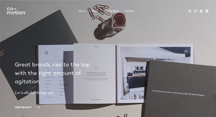
Don’t make users guess where the navigation is, or how it works. Yes, you want your website to express your brand and style but the menu should not be the showcase. Position it at the top or on the left, two areas that users scan first. And make sure the menu items look obviously clickable, are sufficiently bold, and contrast well against the background color.
User Lingo Is User-Friendly
Determine which tasks your users are trying to accomplish with some Voice-of-the-Customer Research. With that information, select terms that relate to how users express what they are trying to do or find. A user-card sort could be helpful here! This extra investment in time and effort will help you avoid jargon and site organization schemes that have meaning within your organization but not necessarily for your site visitors.
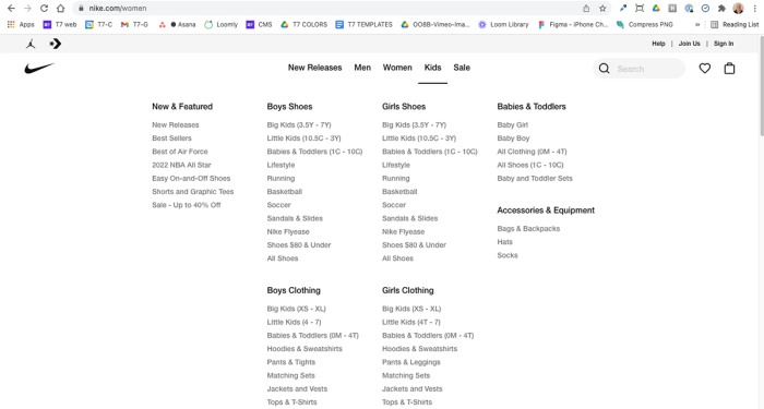
Utilize Mega Menus for Deep Content
Using a mega menu is best for websites with multiple levels of content. Mega menus are expandable menus in which second and sometimes third-level menu options are shown at a glance. It takes some thought to determine the best way to display the options, so the user has a good overview of the site without being overwhelmed. Group related secondary and tertiary menu options, as determined by a user card sort, and list them in order of importance, popularity or following the user workflow.
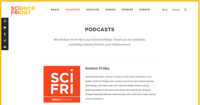
Where Am I?
Orient users to their location within the site through menu styling, for example, highlighting the tab for the section of the menu they are currently on. Using breadcrumbs as a secondary navigation tool is another way to help the user understand where they are. According to Nielsen Norman Group, “Failing to indicate the current location is probably the single most common mistake we see on website menus.” And this is even more critical in these days of Google search, when many of your site visitors are not entering from the home page.
Visible Menus Are Best
You want a really clean look for your site, but a hamburger may not be the best way to style the menu for desktop. According to the latest research from Nielsen Norman Group hiding the navigation resulted in poor user experience along 3 key measures: discoverability was cut by half, task time was longer and perceived difficulty of executing a task increased. Follow their rule of thumb: Don’t hide menus when there’s ample space to display them.
Design for Accessibility
Designing for accessibility is design for everyone, including users with low vision, color-blindness or mobility challenges. Font size, color contrast, and compatibility with screen readers are all important factors. A few tips to get started: don’t use color alone to distinguish things like error states or required fields in forms, make sure there is sufficient color contrast between text and backgrounds, and avoid having elements that only show on hover. For a deeper study, review WCAG 2.0 and ARIA guidelines.
Summary
Revamping your menu structure might be an interim project as you wait for the budget to tackle a full-site redesign, or it could be part of the redesign process itself. We hope this post has convinced you of the value of giving significant thought to your menu, possibly with the aid of some Voice-of-the-Customer Research. In our view, there’s no such thing as a menu that is too clear, too direct or too user-friendly!