
Just recently the designer of the TEN7 logo, Aaron Draplin, announced that he had designed a United States Postal Service Forever Stamp! It made me think that it might be fun to take a trip down memory lane, and tell you all about how we worked with Aaron to create our logo.
Aaron Draplin is a Patriot
Designer Aaron Draplin is a trucker-hat wearing, rock’n’roll loving, American-flag-waving patriot. In my wanderings on the internet I found a video of him talking about how America is F*cked (Design-wise Anyway). I agreed with everything he said in the video, so I tried to find out more about him. “Wow,” I thought to myself, “he’s worked for BURTON, a giant snowboard company, and for Target, Patagonia, and for President Obama for crying out loud!” TEN7 was at the point where we needed to invest in an official logo, so I decided right then I wanted him to be our designer. But, why would he want to work with our little company in Minneapolis?
Well, you never know until you ask. So, in the fall of 2010, I sent him a tweet:
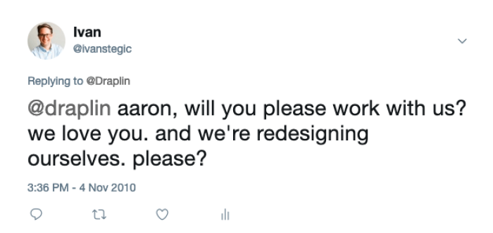
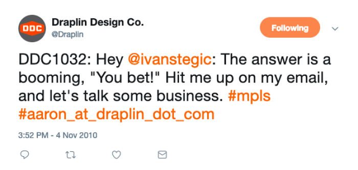
And he wrote back right away!
So we chatted a bit, and he was so personable, so approachable. I was so excited! At that time, we still had an office in Minneapolis, and he was in Portland, so it was our first time working with someone remotely. We created a Basecamp project, gave him access to it and launched the project!
The Design Selection Process
Aaron started the logo design process with a questionnaire. He wanted to know my vision for the company. He wanted to see the aesthetics of things I liked. He basically did general discovery with me for the logo, in the way we do discovery with clients for their website. So I answered all his questions, and he went off into his secret design lab to create something.
I wondered: What if he designs something I don’t like?
I quickly realized I had to let go and trust the process. He is a pro, after all! All the good designs he did for his multitude of clients couldn’t be an accident.
Round 1 – So. Many. Logos.
In January 2011, he sent us a 16-page PDF with the first round of logos: there were 112! One. Hundred. Twelve! There was a mix of possible logos alongside others that would be appropriate if we were a medical device company or a radio station. And there were guitar picks. I wonder if he threw in some purposely outrageous logos just to give us something to react to. However, I was relieved that I liked a whole bunch of them! Here’s just a sample of the many logos from round 1.
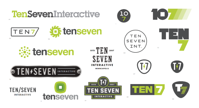
Notice anything in this group that looks familiar? Aaron had created a pretty close version of our final logo in the first round, see #49! However, we didn’t know we liked that one yet.
How to get TEN7 team members’ opinions heard? I decided we needed something tactile, so I printed out all the logos in full color, and laid them all out on the office ping pong table. I put dots on the ones I liked and asked the other TEN7 employees at the time (only Lex remains from that bunch!) to do the same. We sent off our preferences back.
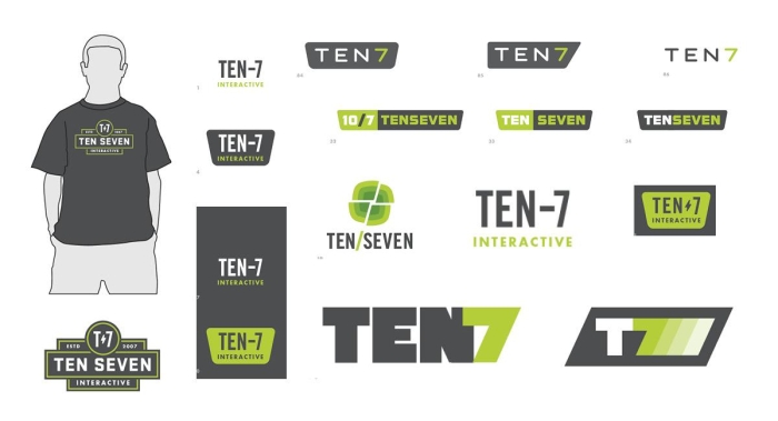
Round 2 – Greens, Greys and Shades
Aaron Draplin came back with 13 pages of logos in the second round that were a combination of ones we liked, variations on those, and some brand new options. He showed us logos on different backgrounds. He used the colors we’d chosen for old logo (green and gray), but he mixed and matched different greens and grays and changed shading. Here are samples from round 2:
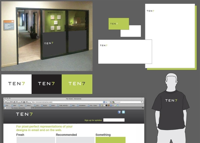
Round 3 – Fewer Logos on Different Things
Round 3 showed fewer logos, placed on more things. He showed logos on a website, on envelopes or letterhead, on a T-shirt, and on the door of our office, so we could see how our branding would look across different media and objects.
Round 4 – Name Changes
By the fourth round, we had gotten down to four logo variations. Along the way, we had solidified our brand and how we write our name.
Up until this point we had used this as our logo:

As we selected the logos we liked, we discovered that the way we preferred our company name was not with “seven” spelled out. We also had to figure out how important the word “Interactive” was in the logo. He gave us several versions.
Rounds 5 through 11 – Fine Tuning
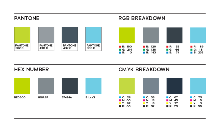
By the fifth round, we had chosen the logo we wanted! Now it was time to refine. Aaron gave us the logo in many different colors.
We also needed a black and white version for various purposes, so he made a version that is slightly different from the color version.
We iterated through a few different business card designs. Truthfully, Aaron nailed it pretty much right off the bat; most of the tweaks were deciding where to place the various bits of info.
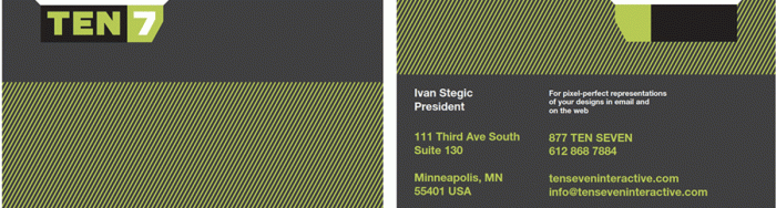
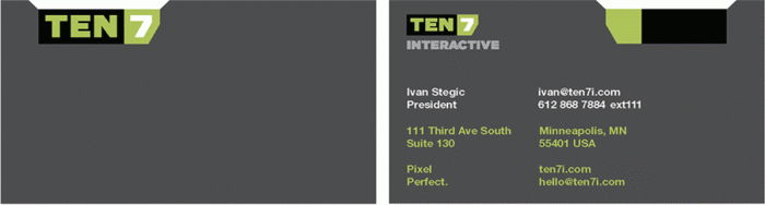
Something that we did for the business card that I really like is the notch at the top. And, just fold a TEN7 sticker over it. I figured out later that it works pretty well on envelopes too!
Towards the end, we realized that we needed to switch fonts. The fonts in the final design were Gotham Black and Gotham Ultra, which at the time did not sport a web font. As a web agency, it would be problematic if we couldn’t implement our own brand online! The replacement font that we went with was Adrianna.
That font happened to be made by Chank Fonts based here in Minneapolis, which was a nice coincidence (as we like to support our fellow Minneapolis businesses)! As a bonus, if you happen to be writing a document with Adrianna Extrabold and type “TEN7,” it will look very close to the logo! This was a deliberate design decision.
The Final Logo
So after eleven rounds of design, selection and refinement, we finally had our logo!
During the whole design and selection process, Aaron never gave us his opinion about what the logo should be. He let us tell him what we thought about all of them.
It’s amazing that he actually nailed the logo in the first round! But we didn’t know what we’d like until we saw all the logos.
The differences between the logo in the first round and our final logo are subtle:
- Changed font (from Gotham to Adrianna)
- The gray background is slightly darker
- There is more space between the letters
- The middle section of the E is shorter
Since we also use the letters “T7” as an abbreviation for the company name in several places (like shortened URLs, or if we’re naming things and need a prefix), Aaron did a version of T7 in the style of the logo.
TEN7 Logo Rules to Live By
Aaron also gave us advice on how to use the logo:
- Size: It should never be large. It should always be small.
- Placement: It should be in a corner, just out of the way. It should hug the top edge if possible. It should never wrap around the left edge.
- Case: The word “TEN” must always be in all caps. Actually, he said something like, “To keep the integrity of the logo, NEVER, EVER, EVER write the TEN in any combination of upper and lowercase. It will look like SHIT.”
- Spacing: Never put a space in between TEN and 7.
Recent Tweaks
Since we commissioned the logo design in 2011, we stopped using the word “Interactive” anywhere in our name, as part of the logo or not. The only place it’s used now is in legal documents to represent the official name of the company, which is Ten 7 Interactive, LLC. We also use the T7 form of our logo more often now, especially when we have to fit it in a square or circular space and the detail of the full TEN7 logo might be unclear, like on our Twitter profile. And, in one of the redesigns of our website, we added another color to the TEN7 brand: a baby blue.
Swag, Swag and Cake!
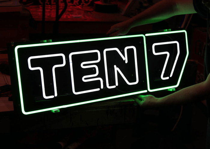
At the time of the logo design we were building out our office, and I decided I wanted a neon sign in there. So I asked Aaron, “What would the logo look like as a neon sign?” Draplin lost his mind, and made us a design for a neon sign. We were his first client that ever had a logo made into a neon sign! We then had it made by Matt Thompson of Skyline Neon Signs, another Minnesota business (those are his hands in the shot)!
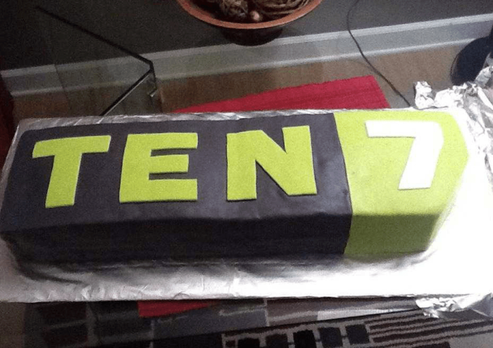
For my birthday that year, Lex’s sister-in-law made a giant TEN7 cake. It was amazing!
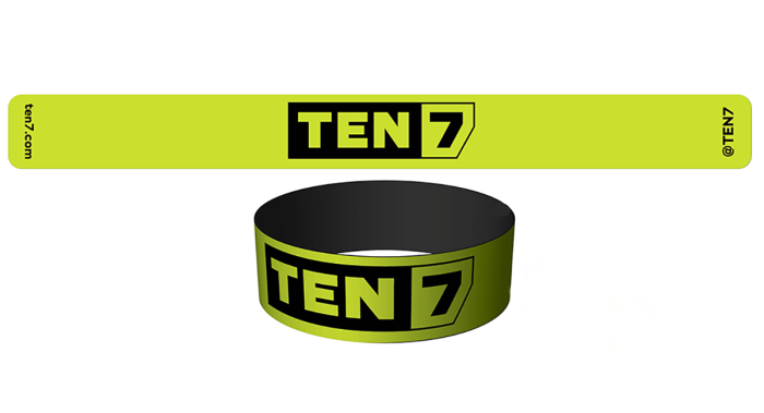
We love schwag, so we put the logo on the standard stuff (notebooks, t-shirts, hoodies, stickers, patches) but once a year for Twin Cities’ Drupal Camp we put the logo on something special, like a bike lamp or a snap bracelet. We made 500 bracelets one year and they were all gone in two hours!
We love our logo so much. (Thanks, Aaron!) We've used it in different ways over the years... have a look.
Aaron Draplin Links
- http://draplin.com/
- His design book http://ddcbook.com/
- We went to see him do a talk for AIGA at the Walker: “Tall Tales from a Large Man.” He does a promo video at beginning of talk, and it includes a photo of the TEN7 neon sign!